
I joined the team as a UX designer to renovate the design system for Orby AI, a cutting-edge SaaS AI platform. My team and I conducted extensive user research and analysis to provide valuable insights that significantly improved the user experience. By refining the design system, our team helped Orby AI users achieve greater work efficiency, streamline workflows, and minimize numerous time-consuming tasks.
Orby AI
Design System

Orby AI Design System
PROJECT TYPE
Design System
POSITION / ROLE
UIUX Designer
TEAM
4 People Group
DURATION
8 Weeks
TOOLS
Figma, Adobe Suites
Problem
As the first step, I investigated the current AI system and had interview with the system designer and users. I noticed that the target users’ tasks are time-consuming, but the current interface is inconsistent which can create confusion, leading to frustration and reduced workflow efficiency.
Thoughts
After all the research, I realized the best solution is to create a design system and pages with a clear interface and streamlined workflow. Eliminate unnecessary steps and address users' needs more directly to improve efficiency and help AI easily learn the process.
The Goal
The project goal is to give users a smoother and intuitive experience and obtain all their needs for finish tasks. Use more organized and efficient tasks creation structure to help user save more time on daily works.

Over the 8 weeks, we adhered to the User-Centered Design process to explore how the AI platform could enhance work efficiency for users. Here are the steps we took to iterate on the design systems for our client:


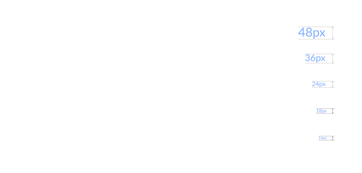
Typography
Based the needs for different users, we selected open source fonts for each different graphical operating systems.
Color
Color Scheme

Components
Categories
After studying the existing components and exploring potential additions, we categorized 25 types of components into 5 main categories, based on their functions and user workflow.


After categorizing the components, we assigned each component to each team member. My responsibilities included:
Individual Works
-
Dropdown
-
Date picker
-
Time picker
-
Progress bar

Task 1.0 Update the Date Picker
When looked at the Dashboard page, the period selection is problematic, with limited selections that and inconvenient interface.
Current dashboard page

In the previous version, there only offered a few options to change the date range, such as the last two weeks or the last month. This was because users typically selected date ranges in specific scenarios, like checking bills or reviewing receipts.
Now, with our enhanced functions, users can access more valuable data, including the number of tasks, error reports, and degree of completion.
These updates require the new version of design system to provide a more flexible and handy date picker. By research on several well-established design systems and analyze our product’s using scenarios, I figured our in the first date picker iteration version, we need to add default state, basic usage, and range selection.

Task 1.1 Basic Usage
The primary need from users is to select a time range from the calendar, including options for a specific date, week, month, or year. I simplified the operation steps to streamline this basic usage scenario, making the selection process as easy as possible.

Select a week
Default state
Select a month
Select a day
-
Most of the user open the date picker wants to get today’s information. So when user click on the date picker, it automatic selects on today’s date. User can also click on other dates per their need.
-
To help users select the month and year quickly, using the arrow buttons next to the current month and year is the most efficient method.
-
User can click and drag to select multiple dates, like a week.
-
By clicking on the “Today” button, the date can quickly switch to today’s date. So user doesn’t have to screw the month and date.
Select a year
-
Based on research, some users need to select a specific year to understand the previous data. So, we added drop-down function when user clicks on the year or month, they can pick the specific month or year as needed.

Task 1.2 Advanced Usage
Based on user feedback, there is a demand for the ability to select specific date ranges in addition to the basic functionality. For instance, some users wish to view data collected during specific promotion periods, such as from August 15th to September 5th. Therefore, after completing the basic date picker functionality, I decided to enhance and expand the component to meet these specific needs.
Default state

Select a specific year
Select a specific date
Select a specific range
Select a specific month
-
After user testing, we found out the range of commonly used dates.
-
Today, yesterday, last week, last 15days, and last month are at the top selection.
-
Custom date is a useful function based on users’ feedback. So we added it in this quick selection panel.
-
We still keep the month and year drop down function as it’s an essential function for user.
-
When the regular month calendar can’t show the full date. The calendar panel will expand to show two months.
Task 1.3 Beyond advanced Usage
In addition to the previously mentioned states, I have further analyzed our business scenarios and developed some new ideas. After discussing them with my design leader, we believe these new ideas will help users quickly complete time selection, review past tasks, and plan future schedules.

Schedule meetings function
Auto save function
Auto export to Google sheet
Task 2.0 Time Picker
Based on extensive research and users feedback, time picker is another necessary function that helps user to narrow down the specific time and let Orby AI generate a specific results for the user.
For users with high order and data volumes, such as large enterprises, thousands of orders may appear within a single hour. These users need to review order information hourly. A time picker can help select specific time ranges, making it easier to understand data changes over time and receive alerts for any abnormal data patterns.

Task 2.1 Basic Usage
To meet users' needs for specific time selection, I provided this quick time picker component to help users speed up the process of entering time, ensure consistent and error-free time entries, and enhance the overall user experience.
Version 2
-
Upgrade the time select panel to scrolling and selecting
-
Simplify the interface
-
Easy select
-
Flexible between 12-hour and 24-hour time formats
Task 2.2 Advanced Usage
Some users mentioned that selecting a range of time is also useful. It helps them narrow down the data to the specific range they want to understand.
Version 1
Version 2
Version 1
Task 2.3 Beyond Advanced Usage
After reviewing all these studies, I noticed that combining the date picker with the time picker could be the most efficient method for users to set their task time range. This approach allows for a fully customized AI task tool to evaluate their daily work more effectively.

We added start and end dates/ times, and emphasized the date text. This iteration makes the time picker visually clear.
Version 2
Version 1
After user testing, we realized the monthly date picker was unclear about the selected date. This necessitated a design iteration.
Task 3.0 Update the Progress Bar
The progress bar and steps are crucial for users to set up task commands for Orby AI. After researching and studying the current implementation, it’s clear that the current progress bar and steps provide limited functionality and minimal information, which is not user-friendly. We should enhance the progress bar by adding more important content to improve the user experience.

Apply New Design To Key Screens
The new version progress bar provides users with a more intuitive task setting progress. The setup is streamlined and easy to work with. With each step accompanied by short instructions that eliminate potential constraints, making it easier for users to complete their tasks.

Task 4.0 Drop Down
In the administrator's interface, account management is a crucial function. Administrators need to grant permissions to the company's users, allowing them to use Orby AI to perform their tasks.

New design
Old design
Sending invites by manually entering users' email addresses is not efficient, as users often have long email addresses. It's easy to make mistakes by typing a wrong letter.
A dropdown menu displaying users' general information, such as avatars, email addresses, and team names, will help the administrator quickly find users, reducing confusion and minimizing the chance of errors.
Colors & Accessibility

To create a successful design system for all users, I noticed that accessibility is crucial. Approximately 2.2 billion people globally have some form of visual impairment or blindness. Our design system should include visually easy-to-read elements, such as appropriate colors to ensure accessibility for everyone.
After discussing with our team, we think the Web Content Accessibility Guideline (WCAG) is great instruction to check our design system’s accessibility. The four principles POUR are essential for us, Perceivable, Operable, Understandable, and Robust.
WCAG has different levels of conformance: A is the minimum level, AA is the mid-range level and is often the target for most organizations, and AAA is the highest and most comprehensive level. Based on our user types, we decided to comply the AA level.
Blue is the main color for Orby AI as it’s a professional and trustful AI tool for company use.
I used Color.Review tool to adjust the accessibility of our color system to make sure texts are readable. Based on the iterations of color scheme and status colors, I realized that some colors can’t pass the accessibility test for both dark and light mode, but they works well for only one mode. So we will need to have two color systems for the dark and the light mode interfaces.
Design principles
We defined the following six principles to ensure the design system remains coherent and adaptable.

Dark Mode
Based on our research, there are 60-70% of the users prefer to use dark mode than light mode. It’s reduce eye strain, save battery life, better accessibility, and looks sleek.
So we decided to design the dark mode for Orby AI.

Takeaways
Joining the team and completing the design system for Orby AI was a significant achievement for me. Here are some key takeaways and insights I gained during the process:
